Mastering Typography on the Web
A deep dive into font selection, readability science, and modern Web Design typography.
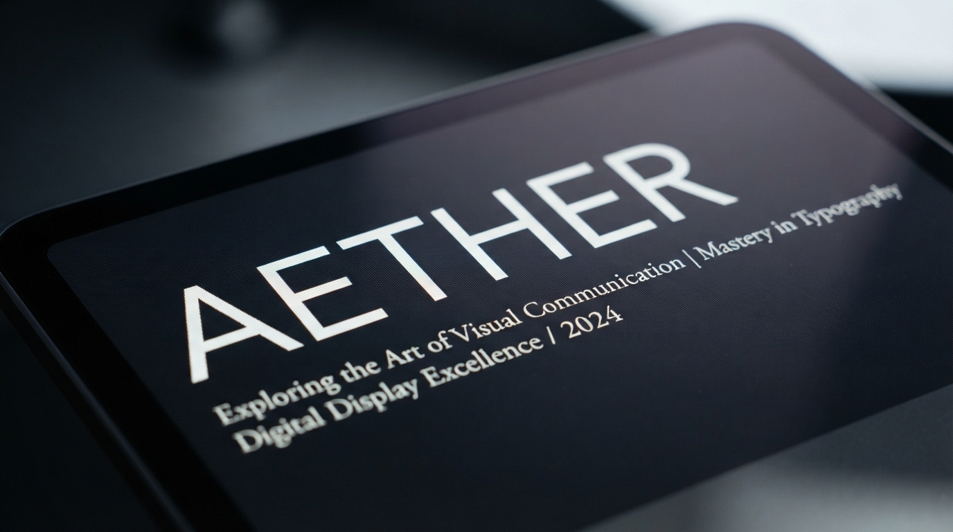
Introduction
Typography is the backbone of Web Design. It's not just about making words legible; it's about conveying brand identity, guiding the user's eye, and establishing a visual hierarchy that makes information digestible. In this comprehensive guide, we'll explore the core principles of mastering typography on the web, diving deep into technical benchmarks, the science of readability, and the future of web fonts.
The Science of Readability in Web Design
Before we dive into the technical details, it's essential to understand how humans read on screens. Readability is not merely subjective; it is grounded in cognitive psychology and visual perception. When a user lands on a Web Design project, their eyes do not glide smoothly across the text. Instead, they move in rapid jumps called saccades, followed by brief pauses called fixations. During these fixations, our brains process the visual information and extract meaning.
Effective Web Design typography optimizes for these saccadic movements. Fonts with clear letterforms, distinct counters (the enclosed spaces in letters like 'o' and 'e'), and recognizable ascenders and descenders (the parts of letters that go above or below the baseline, like 'h' and 'p') facilitate faster recognition. The easier it is for the brain to identify the shape of a word, the faster and more comfortable the reading experience becomes. This is why highly decorative or overly stylized fonts are generally reserved for brief headings rather than long-form body copy.
Furthermore, the contrast between the text and the background plays a vital role. The Web Content Accessibility Guidelines (WCAG) require a minimum contrast ratio of 4.5:1 for normal text and 3:1 for large text. However, pushing contrast to the absolute maximum (e.g., pure black #000000 on pure white #FFFFFF) can sometimes cause eye strain or "halation" for users with certain visual impairments, such as astigmatism or dyslexia. Therefore, modern Web Design often favors slightly softened combinations, like a very dark grey on an off-white background, to maximize comfort during prolonged reading sessions.
Understanding Type Scale
A type scale is a harmonious progression of font sizes used throughout a design. Just as musical scales define the notes in a composition, a type scale ensures that all text elements—from the grandest h1 down to the smallest caption—relate to one another mathematically and visually. Without a defined scale, Web Design typography often feels chaotic and disjointed, leaving users confused about the relative importance of different sections.
Many modern Web Design systems use scales based on musical intervals (like the Major Third, Minor Third, or Perfect Fourth). This creates a rhythm that feels naturally balanced to the human eye. When defining your scale, always start with your base body text size. For accessibility and general legibility on modern high-resolution displays, the body text minimum is 16px, though many contemporary Web Design projects are moving towards 18px or even 20px as the default baseline.
Once the baseline is established, you apply the chosen mathematical ratio to determine the subsequent sizes for h6 through h1. For instance, using a 1.250 (Major Third) ratio with a 16px base yields a scale of roughly 16px, 20px, 25px, 31px, 39px, and 49px. This predictable scaling logic not only aids the designer in making consistent choices but also simplifies the development process, allowing for systematic implementation using CSS variables.
Pro Tip: Modular Scale in Web Design
Using a tool like modularscale.com can help you generate a mathematically sound set of font sizes tailored to your base font size and chosen ratio. Implementing this scale via CSS Custom Properties (variables) ensures consistency across your entire Web Design architecture.
Technical Benchmarks: Line Length and Spacing
The width of your text block, known as measure or line length, dramatically affects how comfortably users can read your content. If lines are too long, the eye struggles to track back to the beginning of the next line, often causing the reader to lose their place or read the same line twice. If lines are too short, the rhythm is broken by constant eye jumps, causing unnecessary fatigue and a disjointed reading experience.
The golden rule for Web Design is a Line Length of 50-75 characters per line (including spaces). This optimal measure ensures sustained reading without fatigue. You can achieve this using modern CSS properties like max-width: 65ch; (where 'ch' represents the width of the '0' character) on your text containers, ensuring that the measure remains ideal regardless of the chosen font family or user-adjusted font size.
Beyond line length, vertical spacing is equally critical. Line height (or leading in traditional typography terms) dictates the space between lines of text. A solid technical benchmark in Web Design is that the optimal line height is 1.5x to 1.6x the font size for body copy. This allows sufficient breathing room for ascenders and descenders to avoid colliding and guides the eye smoothly to the next line. Headings, however, usually require tighter leading (around 1.1x to 1.2x). Because heading text is larger, the proportional whitespace is more pronounced, and tighter leading helps the heading hold together as a single visual unit.
Furthermore, spacing between paragraphs (margin-bottom) should typically equal the line height of the text to maintain a consistent vertical rhythm. This practice, often referred to as adhering to a baseline grid, is a hallmark of professional, polished Web Design.
Mastering Hierarchy
Visual hierarchy tells the user what's most important and how to navigate the content. It’s achieved through a calculated combination of size, weight, color, and spatial relationships. In effective Web Design, the hierarchy should allow a user to instantly scan a page and understand its structure and key takeaways without reading a single full sentence.
-
check_circle
Size: Larger text draws the eye first. The type scale dictates the relative size differences, ensuring distinct levels of heading importance.
-
check_circle
Weight: Bold fonts create contrast against lighter body text, anchoring sections and drawing attention to key terms.
-
check_circle
Color: Using a secondary brand color for headings or links can separate them from dense paragraphs, adding visual interest while maintaining accessibility.
-
check_circle
Proximity: Grouping related elements closer together (e.g., a heading and its subsequent paragraph) while adding larger margins between unrelated sections reinforces the structural relationship of the content.
The Future: Variable Fonts in Modern Web Design
Variable fonts represent the most significant technological leap in Web Design typography since web fonts were first introduced. Historically, if a designer wanted to use regular, italic, bold, and black variations of a font, the browser had to download four separate font files. This approach increased HTTP requests and page load times, negatively impacting performance and user experience.
A single variable font file, however, contains continuous ranges of design axes (like weight, width, optical size, and slant). This means that instead of loading separate files for weights 400, 600, and 800, a developer can load one file and utilize any weight from 100 to 900, sometimes even adjusting the width from condensed to extended on the fly. This significantly reduces overall file size and page load times while offering designers unprecedented control over typography.
In practical Web Design terms, variable fonts enable incredibly nuanced typographic adjustments. For example, a designer can subtly increase the font weight on dark backgrounds (where text often appears visually thinner) or smoothly animate font weights on hover states without jittering or layout shifts. Furthermore, variable fonts support the 'optical size' axis, which automatically adjusts the font's design details—such as contrast and counter sizes—based on its rendered size, ensuring maximum legibility at 12px and maximum elegance at 72px.
Conclusion
Mastering typography in Web Design is a continuous journey of balancing aesthetics, technical constraints, and human psychology. By adhering to established readability science, implementing rigorous mathematical type scales, respecting line length and spacing benchmarks, and embracing powerful new technologies like variable fonts, designers can create digital experiences that are not only beautiful but profoundly functional and accessible.
Remember that typography is the voice of your Web Design. Make sure it speaks clearly, confidently, and comfortably to every user who visits your site.
lightbulb Key Takeaways for Web Design Typography
- check_circle Prioritize Readability Science: Optimize for saccadic eye movements and ensure appropriate contrast ratios for comfortable reading.
- check_circle Establish a Type Scale: Use mathematical ratios starting from a minimum 16px body size to create a harmonious typographic hierarchy.
- check_circle Enforce Technical Benchmarks: Restrict Line Length to 50-75 characters and maintain an optimal line height of 1.5x to 1.6x the font size for body text.
- check_circle Embrace Variable Fonts: Leverage variable font technology for drastically improved web performance and finer, responsive design control.